It was about this time when I had the playlist at Blonde Redhead. It changed in time.
Ideation #3: Sketches
Overview
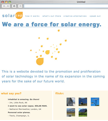
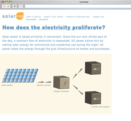
My biggest problem out of the gate in terms of designing the actual page was insuring that the minimalism didn't become too excessive. In keeping with the identity, and certainly with my own design philosophy in the past two years, I'm not in the design business to window-dress. There had to be a certain streamlined feel to this.
The problem became most apparent when I was going too far the wrong way: it was too minimal. It was too unengaging. As you can see, the first round of sketches had that exact problem: it didn't speak enough graphically to let the feeling and tone of the piece complement the material I was showing.

Relatedly, creating flash animations for the introductory page would prove somewhat difficult given the dimensions would either be really wide (but not tall), or really, really large if proportional to standard video dimensions. Given the site is 800px wide (though in the case of these sketches, 600px wide), it would have proven to be a very significant file, namely for what I wanted to do with the flash animations.

The minimalism of the content's layout was more a hindrance based on the columnar design than anything else.
Essentially, optimizing the design was the most extensive part of the creation of the site, followed by the code and the identity.
As can be seen from the videos, the problem wasn't actually solved in finality until the future processes, namely in the implementation stage.
