
Ideation: Identity
Identity
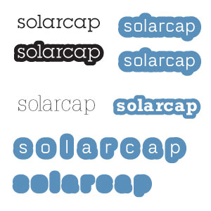
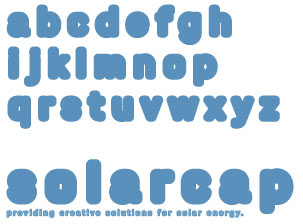
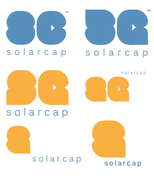
A very considerable amount of time was taken to create the identity for SolarCap. In a certain way, the identity defined the rest of the website in terms of tone, feeling and intention. The color scheme was obvious enough after having deducted not to use green as a dominant color. From the digital sketches, the conclusion came, as it usually does, to celebrate function over form. Much of the time was spent attempting to reconcile style through typography; I was stuck for a pretty good while over the "fat" typography.
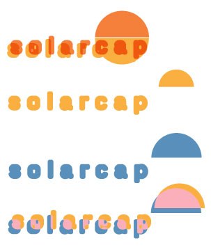
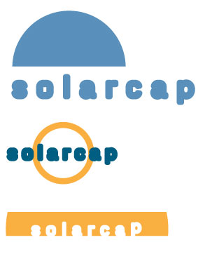
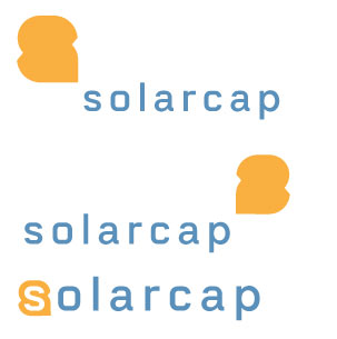
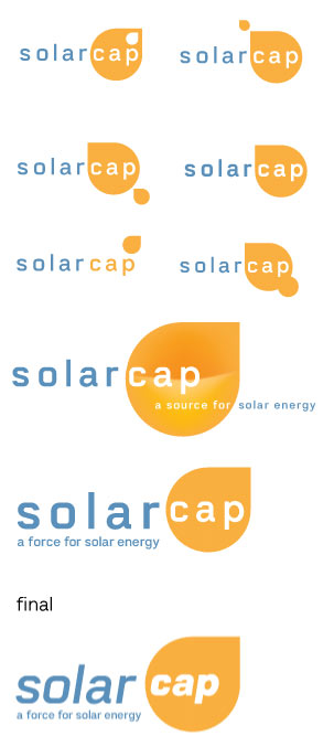
Attempting to quite literally "work backwards," and trying to find conceptual reasoning behind what I was doing, it ultimately came to trying to find a metaphor in the identity that could be translated in some way. The final "mark," minimal but powerful at once, was actually derived from the experimentation of the S form. The drop was actually created when I made a corner for the S, as seen in some of the sketches. Overall, the conclusion came to how the mark, in other functions, could be used ultimately. I then discovered there was a certain function to the drop descending, that it provided a metaphor for solar energy (i.e. "raining down" energy from above). Who's ever seen bright orange rain before?
Nearly Finished